Innocence Project
The First Comprehensive Rebrand for the Innocence Project
The new identity takes inspiration, not only from DNA, which was the symbol for the old logo, but from the many individuals and issues that the Innocence Project influences in order to improve a constantly changing system.
Overview
Since 2015, Madeo has been a trusted partner to the Innocence Project. Madeo designers, developers, and strategists work on a daily basis in collaboration with the organization’s various teams: communications, fundraising, events, and policy. Some of the projects include the redesign of the organization’s website in 2015, a major campaign addressing the Guilty Plea Problem in America, a 25th anniversary campaign, a new platform for long-form storytelling, and much more.
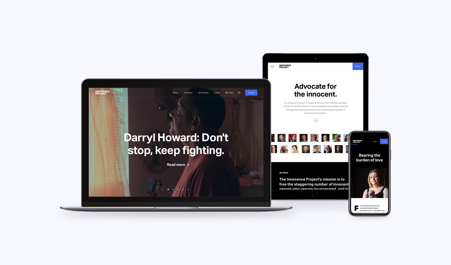
In 2018, Madeo and the Innocence Project embarked on the most comprehensive rebrand for the Innocence Project to date. The rebrand, needed to reflect the dynamic organization that the Innocence Project is today, was also intended as an opportunity to create a consistent and scalable visual system. The new brand identity was created with the goal of supporting the fast-growing brand applications: online, in print, at events, in videos, and on merchandise.
The new identity takes inspiration, not only from DNA, which was the symbol for the old logo, but from the many individuals and issues that the Innocence Project influences in order to improve a constantly changing system. It is designed with building blocks that are constantly in motion, recognizing that the different issues, laws, and individuals that the Innocence Project advocates for are meaningfully connected and important to address, in order to reform the larger system and improve innocent people’s lives.
The new logo may seem incomplete. It is designed to remind everyone that, even though the organization has achieved so much, there are still many more innocent people that need the Innocence Project and all of us to take action. It’s a statement and a call-to-action, inviting all of us to come together and advocate for the innocent.
Advocate for the innocent
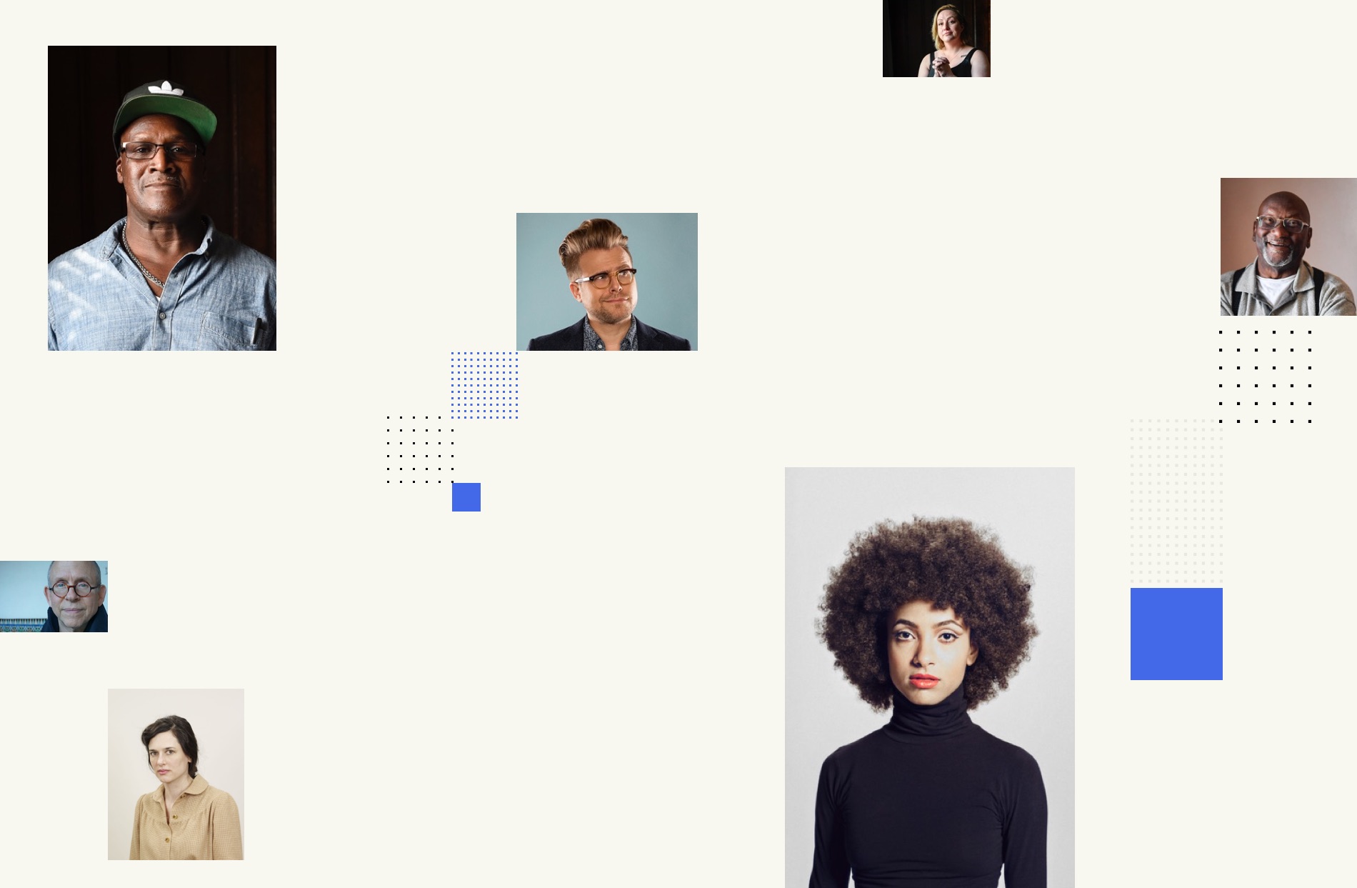
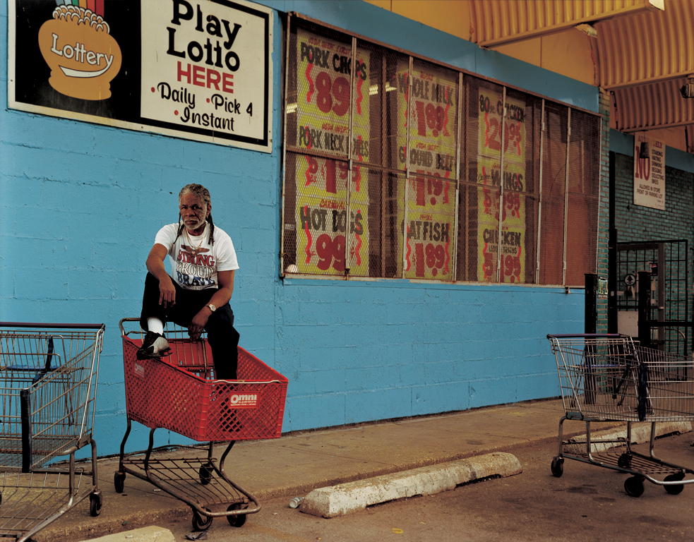
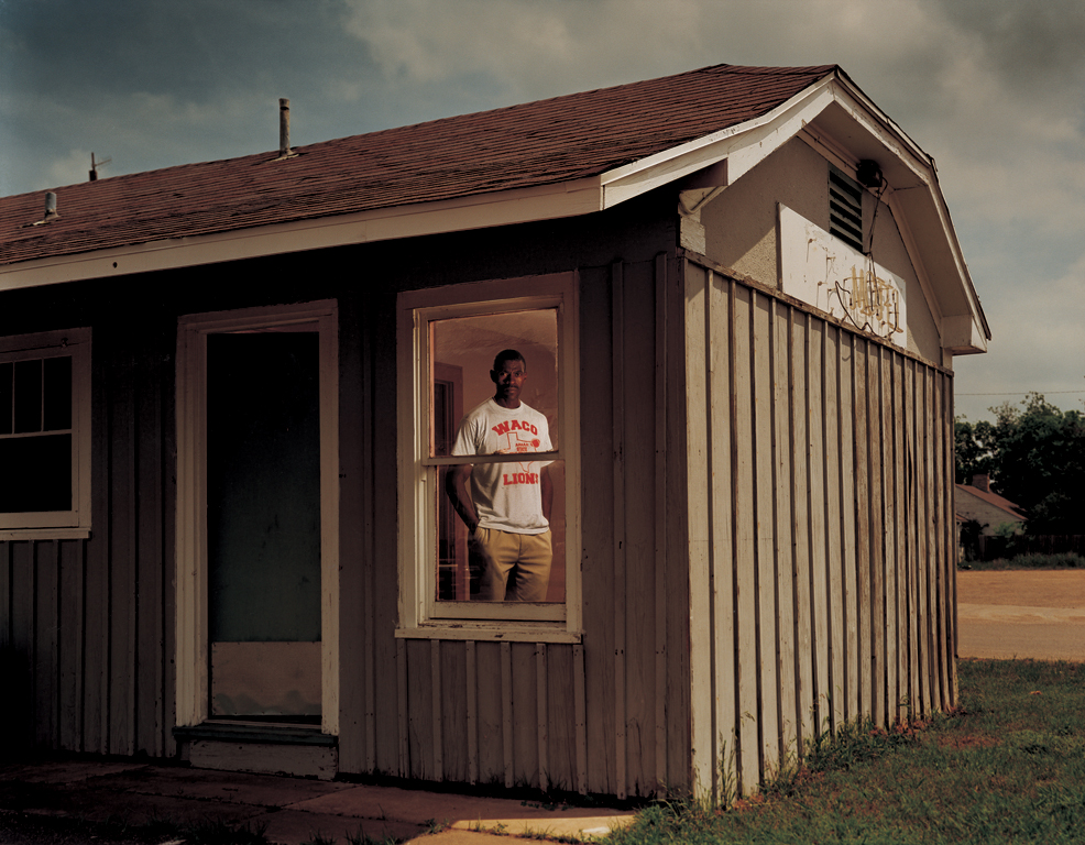
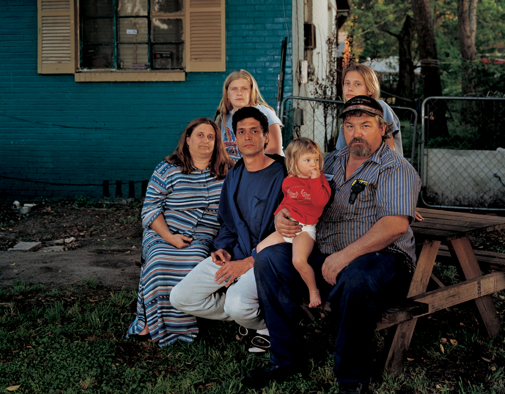
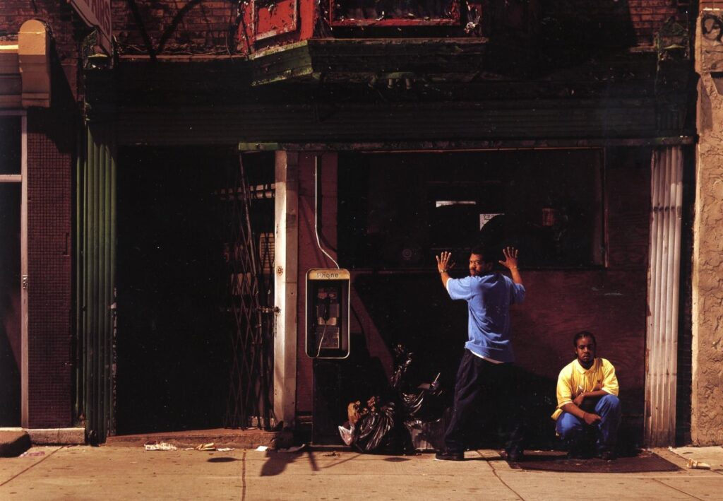
The rebrand project, which started with a comprehensive discovery phase of interviews, surveys, and in-depth evaluation, confirmed our intent in making the innocent and wrongfully convicted take center stage of almost every communication. There are other important elements, like DNA, other scientific tools, processes, and justice reform issues, but they all matter, because they enable the Innocence Project to fulfill its mission of freeing and advocating for the innocent. The images above, by photographer and Innocence Project ambassador Taryn Simon, are prime examples of photography that are incorporated into the visual direction.
The shape of the logo, with a square in motion, almost completing the word ‘Innocence’, was intended to make use of the square as a means of highlighting one person, one issue, or one story worth our attention at a given time. Collectively, they help complete a new justice system that is just for all.
The project was also an opportunity to reflect on the Innocence Project’s brand, allowing us to create a new tagline. The new tagline had two goals: a statement to invite people to get involved and take action, but also to be used as a statement that defines the organization. After several iterations, the words, ‘Advocate for the innocent’ were crafted into a tagline, which can be read both ways.
Sparking action
According to Ramy Nagy, Madeo’s founder and creative director, the team wanted to create a visual system that motivates people to take action. The bold fonts, striking images, and strong blue color work together to prioritize select interactions.
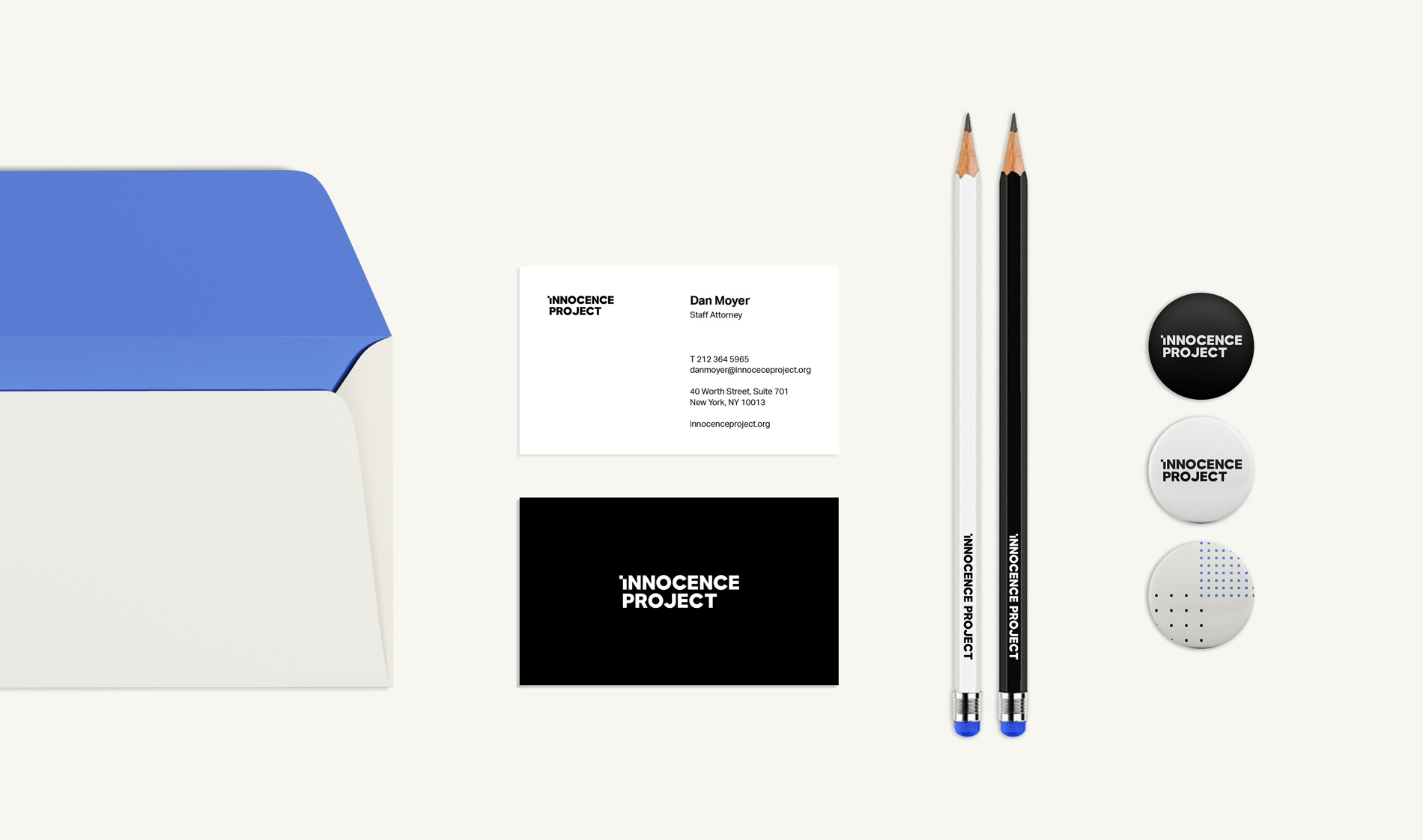
The new brand identity relies on a minimal color palette, with a neutral white background that allows photography to take the center stage of attention, a warmer light beige that adds warmth, and an energetic blue that stands for action. What inspired the color blue, of the many facets of the Innocence Project’s work, was seeing the handwritten letters that wrongfully convicted people write to the organization.
Most of these letters are handwritten by the wrongfully convicted, in blue ink and sent directly from prison. These are the initial letters that invite the Innocence Project to work with them in proving their innocence. It was also the hundreds of letters that supporters write to representatives, as part of the Innocence Project’s policy work, that confirmed the color for the designers. It stood for actions that we can all take to advocate for the innocent; whether in writing, online, or at events.
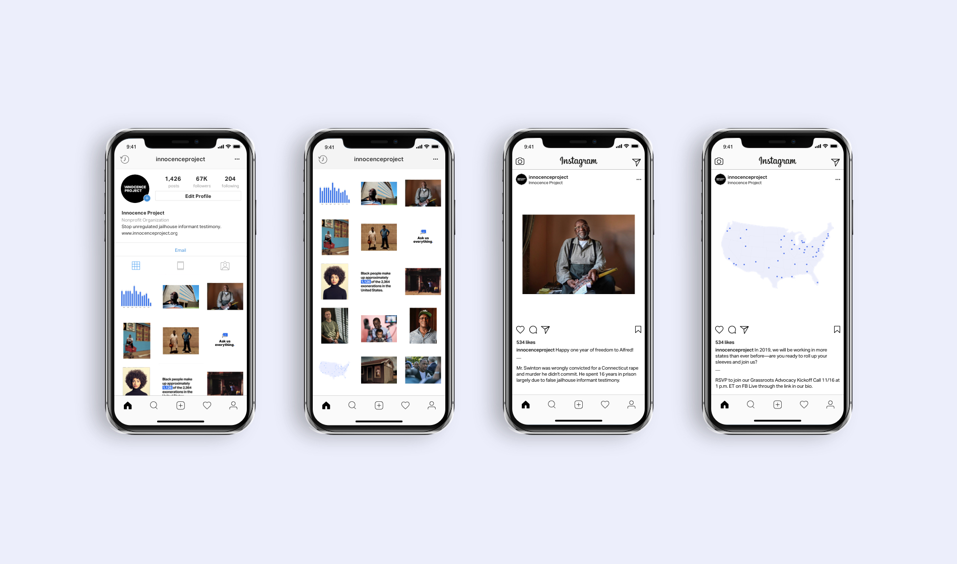
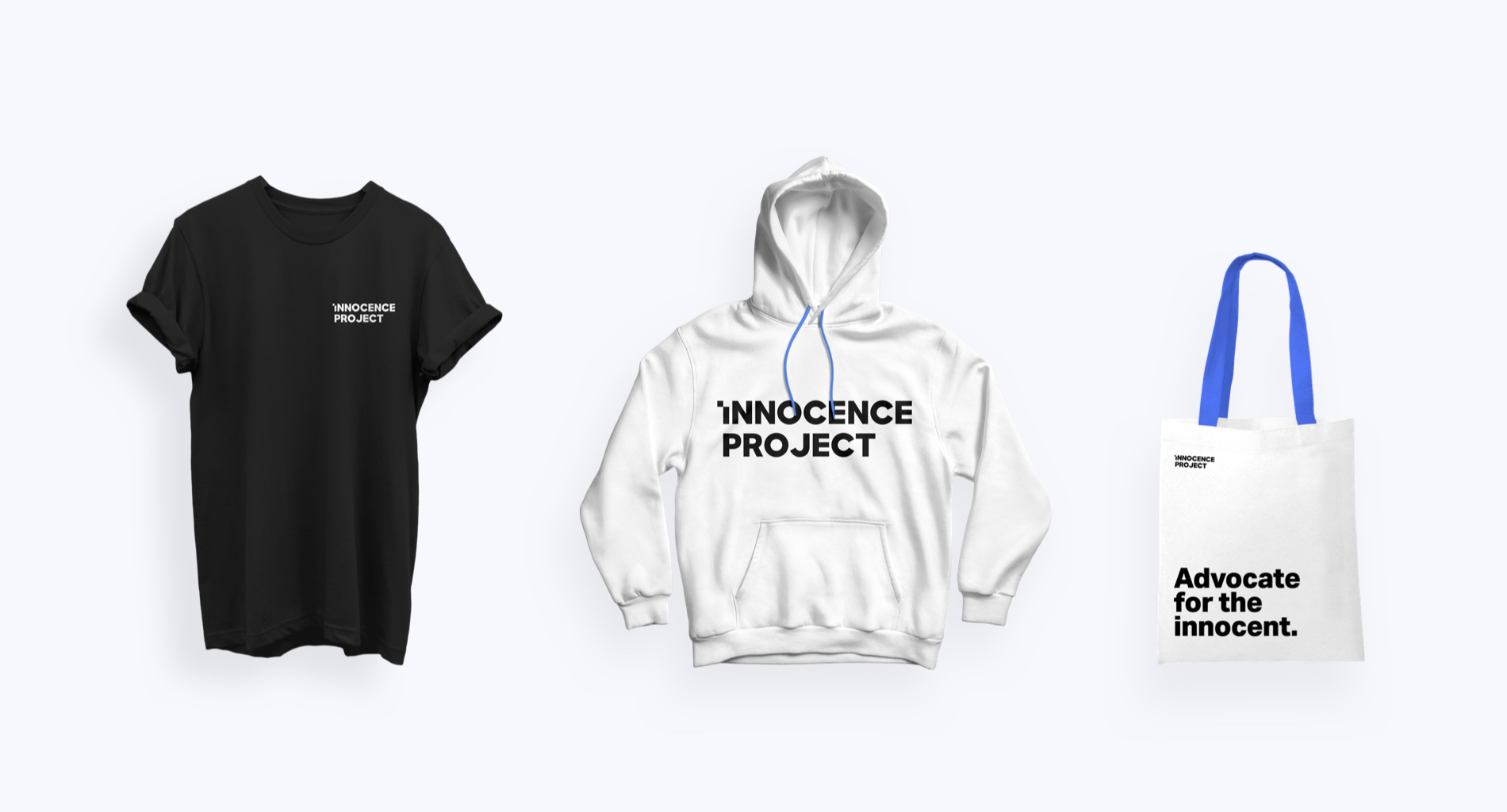
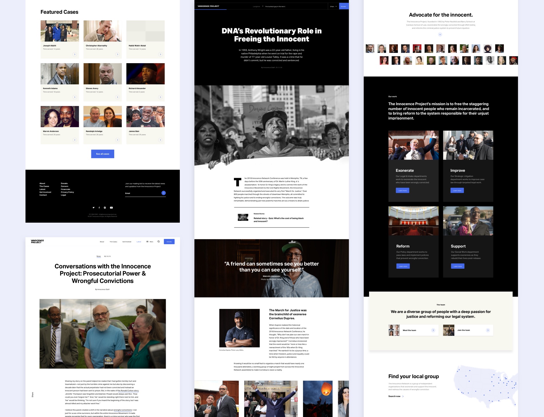
The Innocence Project engages with a large number of people across different mediums. Madeo collaborates with the organization’s staff on how to successfully design and create engagements that deliver meaningful results every day: year-round petitions and policy campaigns, social media community engagement, a robust blog, longer editorial campaigns with special features, branded merchandise that support the organizations work, awareness events, and fundraising initiatives that help the Innocence Project grow with more efforts to advocate for the innocent. With such a comprehensive brand identity redesign, Madeo also redesigned all of these properties, applications, and audience touch points to consistently reflect the new visual direction.
We invite you to explore the different aspects of the Innocence Project’s work through the newly redesigned website. Learn more about the organization and see how you can get involved in advocating for the innocent.