Glisten
Rebranding the largest LGBTQ+ education advocacy organization
A new name, visual identity, and website for the nonprofit organization supporting educators, youth, and advocates for safe, affirming schools.
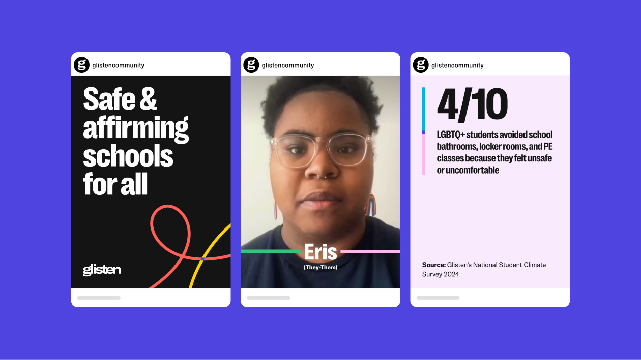
Glisten (formerly GLSEN) was founded in 1990 by educators to advance justice for LGBTQ+ youth in schools across the country. Today, with a network of chapters across the nation, Glisten supports educators, powers youth-led movements, conducts extensive original research, and produces resources and evidence-based policies to support students in K-12 schools.
The organization invited Madeo to lead a comprehensive nonprofit rebrand: reimagining their name, visual identity, and website to better align with who they have become today and the work they do. The partnership began with an extensive research and discovery process to understand what sets Glisten apart. We created comprehensive surveys and led stakeholder interviews. We gathered enough data and confidence to see the value in making the name work better for the organization. Our renaming strategy produced a new name that is pronounced exactly the same, keeping core brand equity from the past decades, but now is no longer limited as an acronym, is easier to pronounce, and expresses the essence of their work. It reflects the shining lifeline Glisten provides to LGBTQ+ youth in schools.
- Brand Research
- Brand Discovery
- Visual Identity Redesign
- Brand Renaming
- Brand Architecture
- Brand Guidelines
- Brand Assets & Training
- Art Direction
- Rebrand Launch Campaign
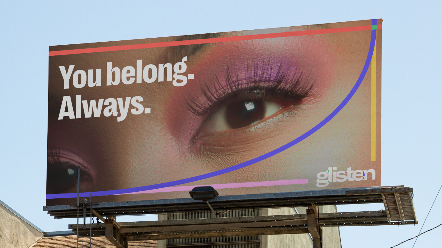
We then created a holistic visual identity design that deeply connected to Glisten’s unique personality: welcoming to students; timeless enough to withstand volatile trends and policies; and operating in the educational space. Most importantly, the brand reflects the organization’s purpose as a safe, affirming place to grow, where youth can foster connection and belonging.
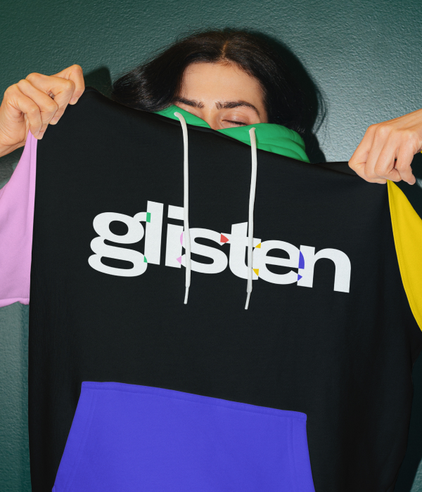
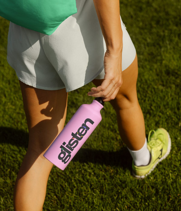
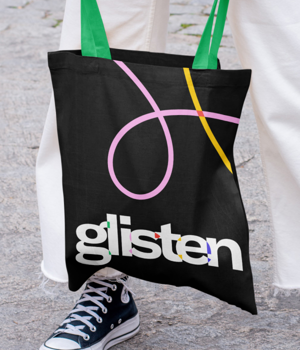
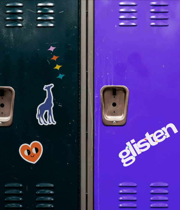
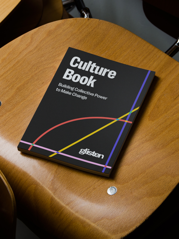
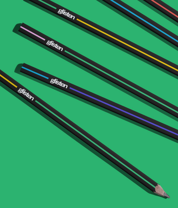
The new logo speaks to the idea that, when people get together, something interesting happens. That intersection, closeness, and connection is what sparks people feeling safe enough to come out or celebrate and be celebrated for who they are. The moving lines express the connections created when Glisten comes together, as a diverse community, to advocate for each other. Vibrant colors are used in unexpected ways, creating a flexible identity that enables them to celebrate the wins, face the challenges, and advocate for a better future. The comprehensive brand guidelines and architecture ensure the identity works consistently across every channel and use case, from chapter communications to national campaigns.
Together, Glisten’s new name, visual identity, and website reflect the collaboration between chapters, students, staff, and educators — all advocating for justice and progress as a collective. This nonprofit rebranding reinforces Glisten’s commitment to creating safe, affirming schools for all while giving the organization a cohesive, enduring identity worthy of the LGBTQ+ community it serves. Visit Glisten to explore their work and consider supporting their mission.
We also redesigned Glisten’s website from the ground up, which was recognized with a Webby Award for Best Website for Diversity, Equity, Inclusion and Belonging. Visit the website case study.