Andrew Carnegie Foundation
Rebranding the Andrew Carnegie Foundation
A new name, visual identity, brand guidelines, and website for the 115-year-old foundation Andrew Carnegie built to advance education, democracy, and peace.
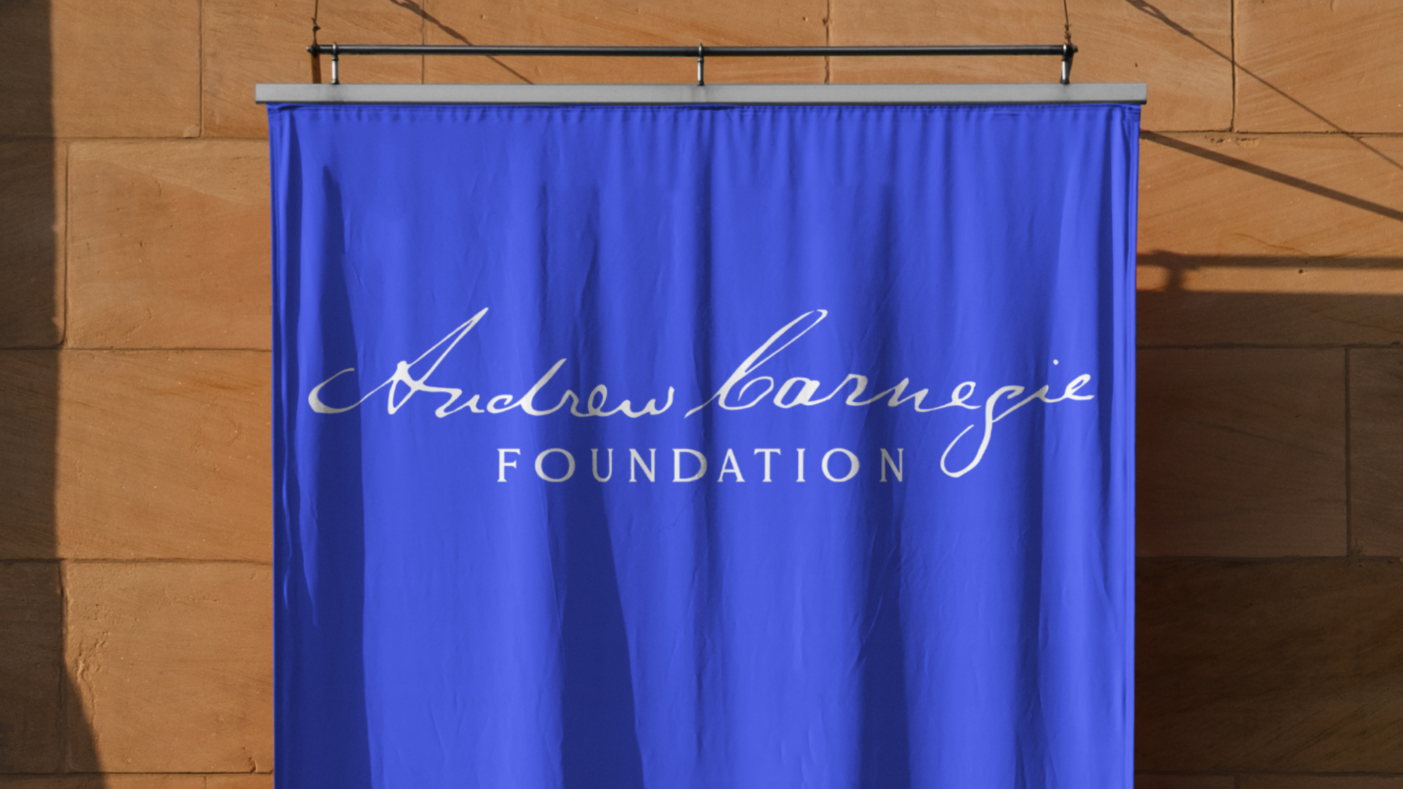
The Andrew Carnegie Foundation, originally established as Carnegie Corporation of New York, is a philanthropic organization founded in 1911 by Andrew Carnegie for the advancement and diffusion of knowledge and understanding. Over a century later, the foundation remains true to its original mission: education, democracy, and peace.
Ahead of its 115th anniversary, the foundation selected Madeo to lead a comprehensive rebrand and website redesign to better align the organization’s profile with its grantmaking goals. Over the decades, the foundation struggled with confusion over its name. “Carnegie Corporation of New York” suggested a for-profit company focused on one city, when in fact its work was both national and international in scope. The foundation leadership decided it was time for a change that would provide clarity.
The new name, The “Andrew Carnegie Foundation,” does both jobs at once. “Foundation” states clearly what the organization is, and putting Andrew Carnegie’s full name at the front draws a direct line from his original vision to the work the foundation does today, while differentiating it from over 20 other Carnegie organizations.
- Brand Research & Discovery
- Brand Renaming
- Visual Identity Redesign
- Brand Guidelines
- Brand Assets & Training
- Art Direction
- Animation
- Web Research & Discovery
- Information Architecture
- Content Strategy
- UX/UI Design
- Web Development
- Content Migration
- Quality Assurance
- Search Engine Optimization

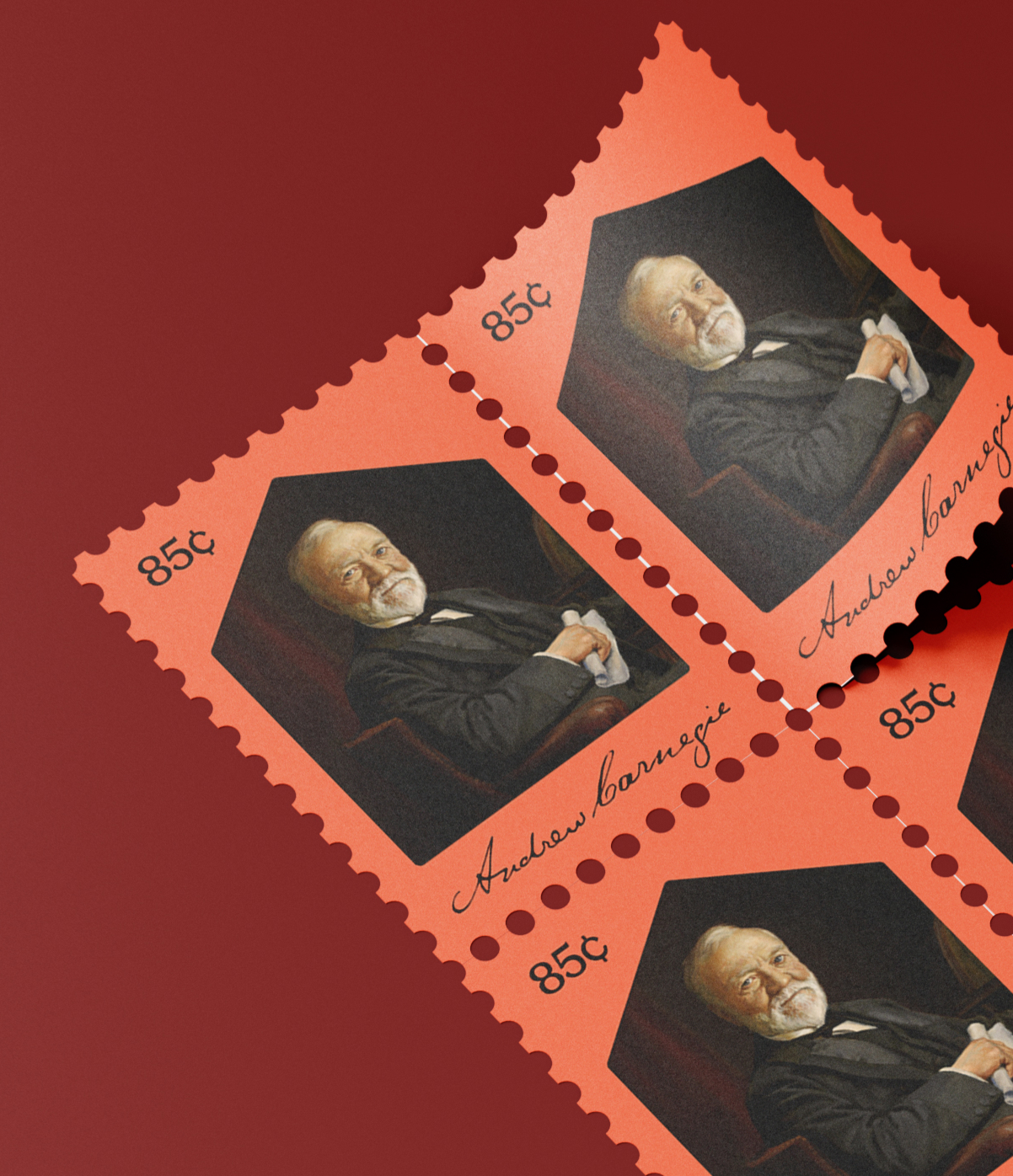
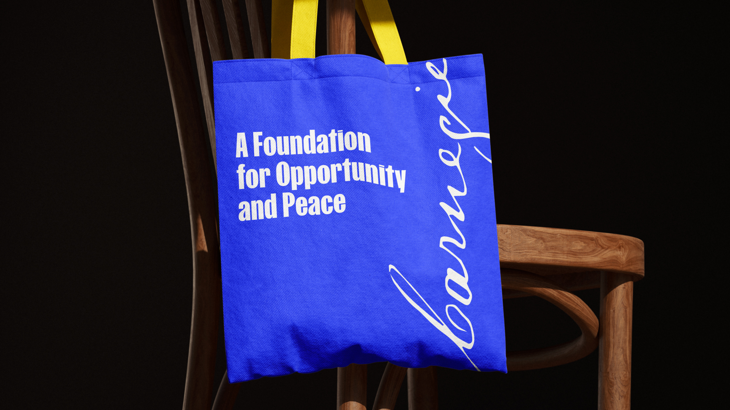
At the foundation’s request, the logo is designed with Andrew Carnegie’s signature, pulled from the foundation’s archives at Columbia University. The brand system reflects the founder’s own values that still influence the foundation today: energetic, authentic, forward-thinking, approachable, and optimistic. The expansive color palette lets the foundation express a tonal range from serious to celebratory, depending on the subject. A color-pairing system, complete with tints for data visualization and UI, keeps that range coherent across every application.
The typography pairs dense, bold energy through the heading typeface with a body typeface that reflects warmth, trust, and authority. A family of geometric shapes brings personality to all platforms and touchpoints. Photography throughout centers the real people and communities supported by the foundation.
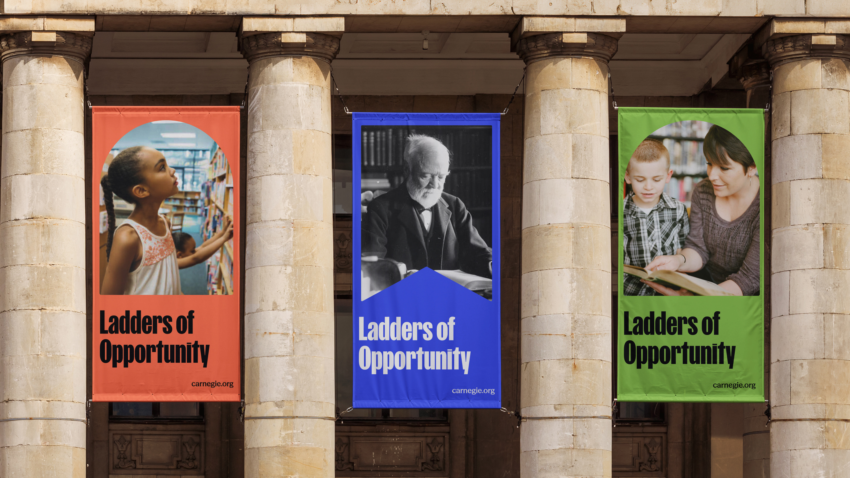
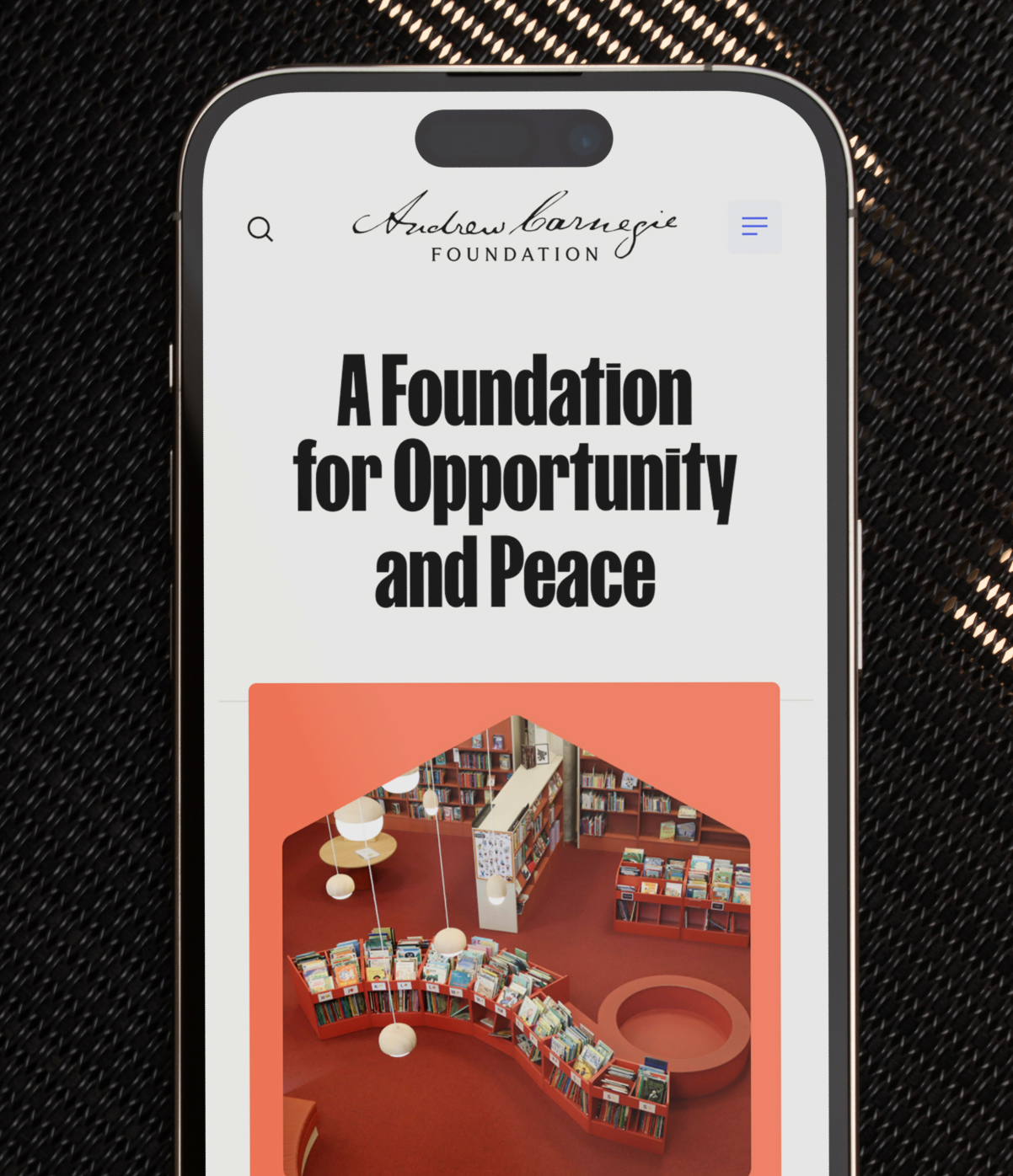
Alongside the identity, we redesigned Carnegie.org and rebuilt it from the ground up. The site organizes the foundation’s work around its two driving goals that reflect Andrew Carnegie’s language: Ladders of Opportunity and A More Peaceful World. The organization’s 115-year history, its grantmaking, and its library legacy are all easy to navigate for grantees, researchers, journalists, and the public alike. The brand’s colors, shapes, and graphic elements shine in flexible, photography-forward layouts that let stories take center stage.

Together, the new name, identity, and website establish a brand that clearly and confidently expresses exactly what the Andrew Carnegie Foundation does. The work reconnects the institution to the founder whose generosity and ambition defined philanthropy as we know it today.